Color Psychology: Choosing Hues that Reflect Your Mood and Personality
By Florence Ellington
17 Jul, 2026
Introduction
The Emotional Impact of Colors
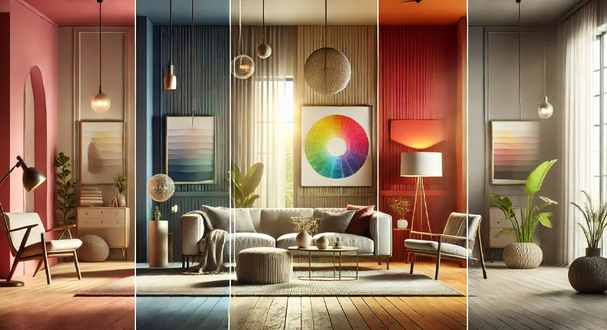
Calming Blues and Greens
- Tranquility and Balance: Blue and green are often associated with nature, evoking a sense of calm and serenity. They are perfect for bedrooms, bathrooms, and relaxation areas where a soothing atmosphere is desired.
- Stress Reduction: Studies have shown that these hues can help lower blood pressure and reduce stress, making them ideal for creating a peaceful sanctuary.
- Versatility: Whether you opt for a soft pastel blue or a deep forest green, these colors can be adjusted to suit different moods and spaces.
Energizing Yellows and Oranges
- Vibrancy and Warmth: Yellows and oranges are energetic colors that can uplift your spirit and stimulate creativity. They are particularly effective in spaces like kitchens, dining areas, and home offices where you need to boost energy.
- Cheerful Ambiance: These hues can bring a sunny disposition to your interiors, making spaces feel lively and inviting.
- Accent Potential: When used as accent colors, yellows and oranges can create focal points without overwhelming the overall decor.
Earthy Neutrals
- Stability and Timelessness: Earthy tones such as beige, gray, and brown offer a stable, timeless backdrop that harmonizes with any decor style. They provide a canvas upon which bolder accent colors can pop.
- Calm and Cohesion: These neutrals help create a cohesive look throughout your home and promote a relaxed, grounded atmosphere.
- Flexibility: Earthy neutrals can easily be paired with other colors and textures, making them versatile for any room—from modern minimalist spaces to more eclectic interiors.
Steps to Choosing Your Color Palette
Start with a Neutral Base
Begin your design journey by selecting a neutral base for your walls, large furniture, and flooring. Neutral colors such as white, beige, or gray create a versatile backdrop that allows accent colors to shine without competing with the overall design.
Select Accent Colors
Utilize the color wheel to identify complementary or analogous hues that work well together. Accent colors can be introduced through accessories like cushions, artwork, rugs, and decorative objects. This helps you achieve a balanced and harmonious look that enhances the room’s mood.
Test Color Samples
Before committing to a full room, test color samples on your walls. Observe how these colors interact with natural and artificial lighting throughout the day. This step ensures that your chosen hues maintain their desired effect under various conditions.
Consider Proportions
Apply the 60-30-10 rule to maintain a balanced color scheme:
- 60% Dominant Color: Use neutral or base tones for the majority of the space.
- 30% Secondary Color: Choose a color that complements the dominant shade to add depth.
- 10% Accent Color: Use a bold or contrasting color sparingly to create visual interest and draw attention to key areas.
Practical Applications in Different Rooms
Living Room
- Soft Neutrals with Bold Accents: Use a combination of soft, calming neutrals on walls and large furniture, accented with vibrant cushions, art, or a statement rug. This creates a balanced, inviting atmosphere that encourages relaxation and conversation.
Bedroom
- Calming Pastels: Opt for gentle hues such as pastel blues, greens, or lavender to foster a tranquil environment conducive to restful sleep. Complement these with subtle patterns or textures to add depth without overwhelming the space.
Kitchen
- Energizing Accents: Incorporate bright, vibrant colors like yellow or orange in small doses—perhaps through kitchen accessories or a feature wall—to stimulate appetite and create a lively cooking environment while keeping the overall look balanced.
Home Office
- Focused and Balanced: Choose cool, soothing tones such as soft blues or greens to enhance concentration. Pair these with neutral accents to maintain a calm, clutter-free workspace that fosters productivity.
Final Thoughts
Mastering color psychology in home design is a powerful way to enhance both the aesthetics and functionality of your living spaces. By carefully selecting hues that reflect your mood and personality, you can create environments that are not only visually stunning but also emotionally resonant. Whether you’re looking to calm the mind, energize the body, or simply add a personal touch to your decor, the thoughtful application of color is key to transforming your home into a true reflection of who you are. Embrace the art of color, experiment boldly, and let your space speak volumes about your unique style.
post
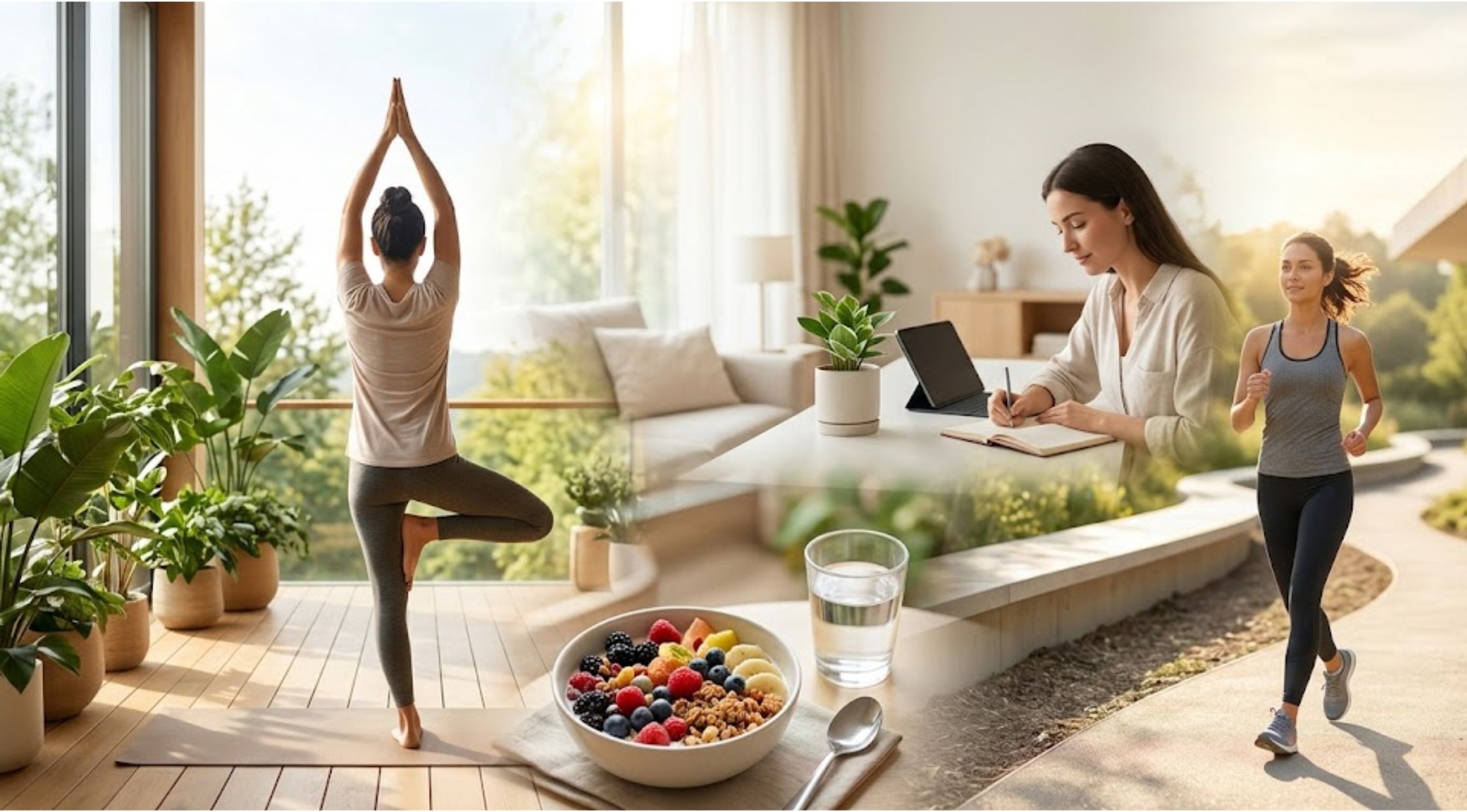
Lifestyle ≠ 17 July
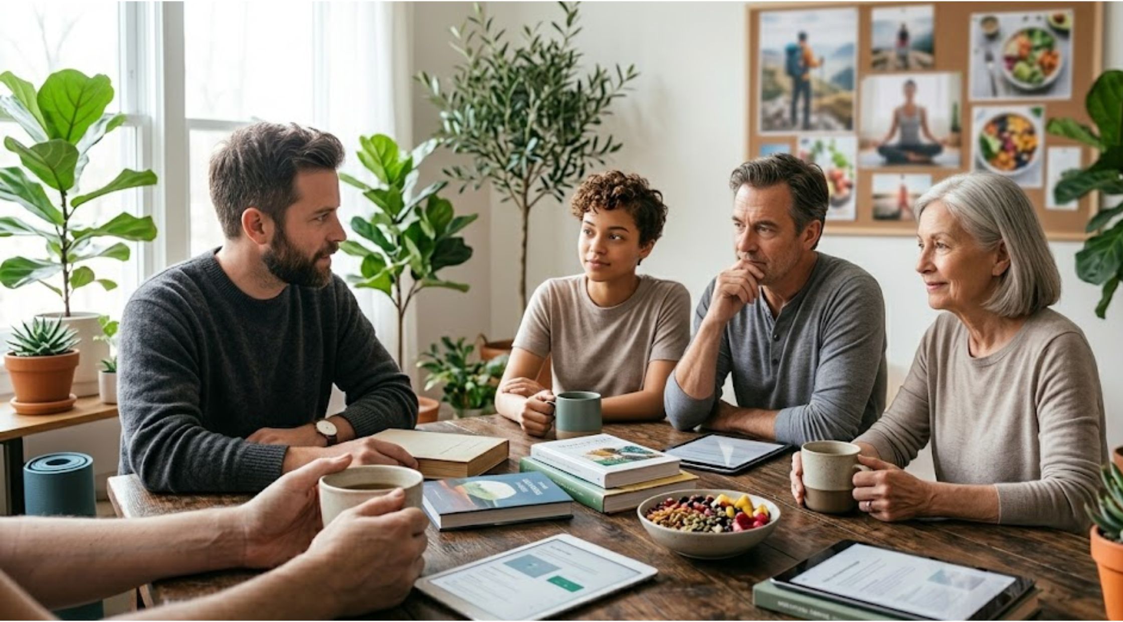
Lifestyle Habits That Shape Modern Living, Wellness, and Everyday Growth
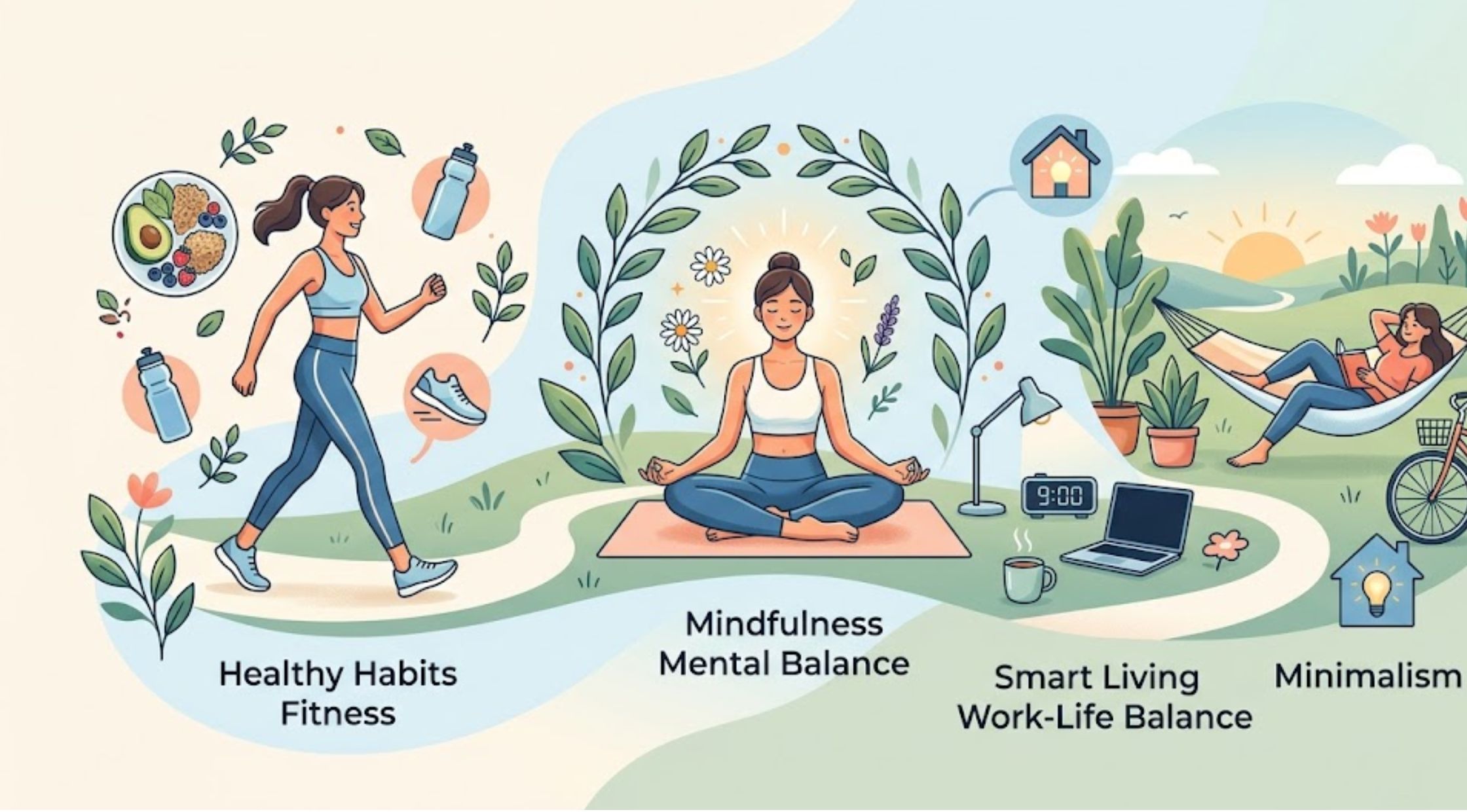
Lifestyle ≠ 17 July
Lifestyle Choices That Shape Modern Living, Health, and Daily Balance
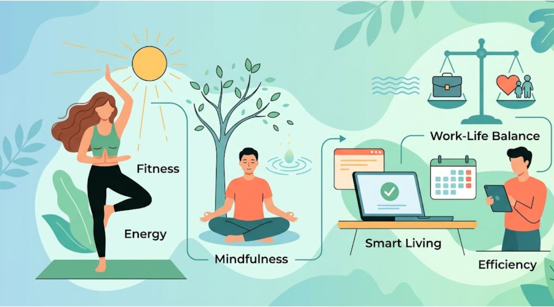
Lifestyle ≠ 17 July
Lifestyle Habits That Shape Modern Living, Wellness, and Personal Success
Lifestyle ≠ 17 July
Lifestyle Choices That Shape Modern Living, Wellness, and Everyday Success
Lifestyle ≠ 17 July
Lifestyle Habits That Shape Modern Living, Health, and Personal Growth
Previous Post
Home & Decor July 17
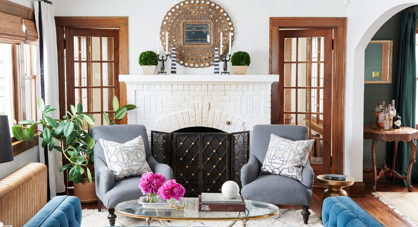
Small Space Solutions: Maximizing Functionality and Style in Compact Areas
Next Post
Home & Decor July 17
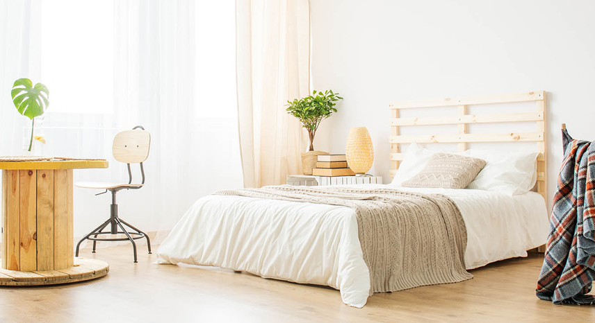
The Art of Upcycling: Transforming Everyday Items into Chic Decor